Behind The Coral Expeditions Logo
After 30 years of operating as Coral Princess Cruises, in 2015 we decided to re-brand to a name more suited to our expeditionary style, and transition to the new name of Coral Expeditions.
This new name stays true to our company’s origins, a small ship pioneer on the Great Barrier Reef, while looking to the future and our evolution to a global expedition company taking guests to farther-flung regions of Australia, Asia, the South Pacific and Indian Ocean islands.
With a new name came a new logo. One that reflected our company ethos, that spoke to our Australian identity and our roots in Far North Queensland, and was distinctively us.
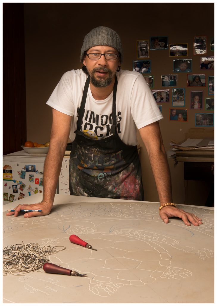
This logo was a collaboration with Cairns-based artist Brian Robinson.
Meet the artist: Brian Robinson

Brian is an internationally renowned Torres Strait artist. His work reflects his traditional knowledge and his love for the culture of his people, and the myths and legends of the Torres Strait. It incorporates traditional motifs and celebrates the renowned carving skills of the Islanders.
Brian was asked to work on the logo because of his cultural heritage, the distinctive linocut patterns in his portfolio and his studio based in Cairns, where the Coral Expeditions head office is also located.
“Exploring the reef as a young child and understanding the habits of many forms of marine life is a very important life lesson for young across the continent. The significance of the surrounding environment is bound to the spiritual origins of the landscape, which includes the sea as well as the flora and fauna and the people that use these resources,” says Brian.
Brian subtly wove these nuances into the Coral Expeditions logo and they have become inextricably linked into the company’s DNA.
The Design Beginnings
At first, we went down the conventional path and hired a brand design firm to develop this new logo. However none of their proposals really reflected “us” and our heritage as a 30-year-old Queensland operator.
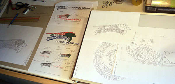
We made the decision to move away from the conventional and pick an artist who had a local connection, who could channel traditional patterns and lore into a logo that would truly be ours. We presented this challenge to Brian, who had never designed a logo before.
The design for the logo was dissected into three main elements – The Green Turtle, the patterns and the colours.
The Green Turtle
The Green turtle, (and sea creatures in general) play a big part in Torres Strait lore and are frequently depicted in traditional art as well as being an integral part of life for many coastal indigenous peoples.
The Green Turtle is known by many names but in the Torres Strait it is called Waru, in Kala Lagaw Ya (Western Island language) and Nam in Meriam Mir (Eastern Island language).
Australia’s marine environment has numerous important habitats for the Green Turtle from coral reefs and seagrass beds to mangrove forests and nesting beaches.
Green Turtles have survived for a long time, and they roam the world’s oceans peacefully and gracefully, so we saw parallels with Coral Expeditions. We thought it would be fitting to have the marine turtle of northern Australia represent our company.
The Patterns
The linear patterns that form a part of our logo are also based on cultural designs from the Torres Strait. These designs are called minaral, which is a traditional language word in Kala Lagaw that translates into English as patterns, designs and decorations.
The same patterns are also used within Torres Strait printmaking, in the stylistically incised traditional patterning that composes linocut prints. They are based on animal tracks, masks, tidal movements, animal skin patterns, bones, hidden effigies, spirits and clan and totemic patterning that binds the artistic work to its place of origin, generally described as Uruy Dhangadh or zig zag patterning. Minaral are based on designs that reflect the natural and spiritual world and can be interpreted in terms of specific meanings and affiliations.
The wave patterns behind the turtle depict the graceful arc of a turtle’s travels across the oceans. Brian’s distinct patterns are so intricate, that they had to be simplified to suit a commercial logo.
The Colours
The colours within the logo represent elements of the land, the sea, and the sky. The seas surrounding our amazing continent, the meandering waterways, the blue skies, and the tranquillity of the reef are captured in the royal navy-blue colour. The red represents our sun-burnt country, the rocks of the Kimberley coastline, vibrant coral forms, and the psychedelic colours of first and last light as the sun rises and sets across the continent.
Creation
Six years on, we have something that we are very proud of, a logo that is unlike all other cruise brands – a logo that is distinctively Coral Expeditions.


